
Apple recently revealed a bevy of new features coming to iOS 18, iPadOS 18, and macOS Sequoia. There’s a huge focus on AI – now branded Apple Intelligence – alongside deeper customization of the home screen and control center, the “biggest redesign ever” for the Photos app, as well as new features for Messages, Mail, Notes, Safari, Apple TV, Journal, Maps, and Wallet. It feels like a shift that touches almost everything on your phone, even if only slightly.
Meanwhile, from the hands-off, external view, it all feels like far too much, an ocean’s worth of stuff just about breaching the dam of Apple‘s clean systems. Apple Intelligence is fascinating, with system-wide features that don’t intrude too much, plus assumedly groundbreaking privacy features. Yet, the image generation capabilities look awful and clash gratingly with Apple’s brand. Combine the overhaul that AI brings with the long list of tweaks to the OS and apps therein, and it’s starting to feel like iOS is suffering from feature creep.
Just like most people only use one or two of the seventy settings on their clever washing machine, just like Netflix decision-making has become impossible with so much to choose from, the more options Apple gives me, the more difficult I find it to actually utilize any of the newly added features. This overload should make me happier, like any Android user, yes? Well no, I just can’t engage.
I first thought this when Apple introduced focus modes in iOS 15 in 2021. Focus modes offer different notification delivery options based on where you may be, such as at work, school, or winding down in bed. It sounds pretty simple, but it really isn’t.
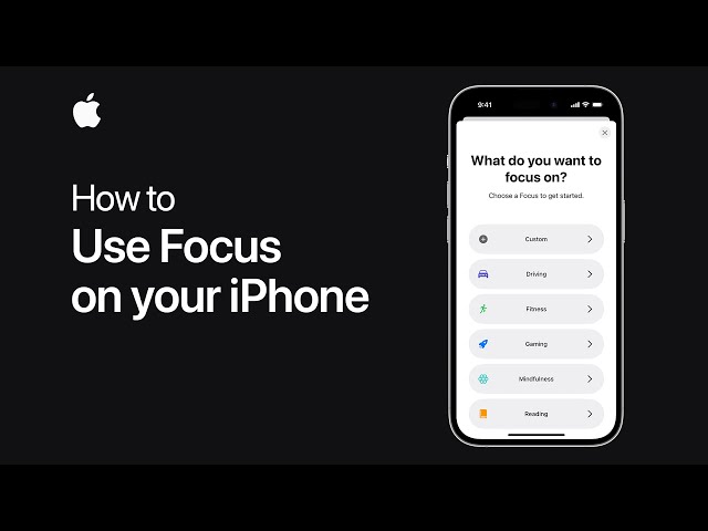
Your iPhone can automatically create focus modes for you. Your work focus could include Slack et al. while a sleep focus blocks everything. However, if you try to conjure up a focus of your own, you decide who can contact you and what apps can notify you. So, you open the focus settings and it offers you all of your contacts to choose from and every single app you have downloaded. There’s no way you can make that sort of decision. So, you accept all or nothing. It’s either Do Not Disturb or, “Hi, can I ask who’s calling?” / “Hello sir, we heard you were involved in an accident at work and we’d like to help you with your personal injury cl-…”
I have three focus modes. Do Not Disturb means no notifications. Work means no notifications unless they’re from my mother. Sleep means no notifications and a little alarm widget on my home screen to check my wake-up time plus sleep tracking on my watch. This is nice enough, and my different focuses automatically activate depending on context. I have a system that works for me, but it took me two years to realize what I wanted this feature to do. I had to deal with bad focus modes to realize I wanted something simple. I didn’t know what I wanted for two years.
Now, customization is going to a new level. In iOS 18, you can put apps on your home screen wherever you want — they don’t have to be right next to each other — and change the color of all the app icons to create an overall theme. This is okay if you have taste or even the slightest grasp of visual aesthetics.
You can create a new look for your iPhone by combining a sleek background and matching app color. You can see quite a few lovely versions on the Apple website for iOS 18. Having said that, you can also create something truly ugly, which until now has been quite difficult to do on iOS. What’s most telling is that, on the iOS 18 website, not all the home screens are pleasant. Some are quite the opposite.
Worst of all, the legibility of app icons goes down massively when they all share the same color. This is a great example of poor user interface design. I am no UI wiz, but at Apple, there are people who are experts in this field. They’ve made a simple-to-use, somewhat charmless operating system for a straightforward user experience over many generations of iPhones. I want them to make the decisions for me – they know what’s best. Instead, I now have the opportunity to make my experience worse, which is not a good thing.
This same issue applies to the control center. I already have enough trouble deciding what apps to put in this drop-down menu. Time after time, I swipe down from the top right of my screen to tap on the stopwatch icon and instead tap on the alarm clock icon. Why would I want even more options? Given that, why would I want to have a Snapchat button instead of a camera button on my home screen?
Of course, people can customize or keep it vanilla, but the choice betrays something quite serious: Apple doesn’t seem to know what’s best anymore. If I have a Snapchat icon on my home screen, I still have to unlock my phone, so it’s a home screen button that only I can use. But what if my friend wants to borrow my phone to take a photo? What if I’m in the dark and need my flashlight, and suddenly I open Snapchat and I’m looking at a shadowy picture of my own horrible face? Anyone out there who is planning to change those two home screen icons, I do not trust your decision-making.
While it’s personal, I believe the value of iPhone vs. Android (or Mac vs. Windows) is the lack of customizability. Simply put, the fewer choices, the cleaner my experience. I don’t want to use an Android phone unless it’s as a tinkerer, fiddling around with all the settings and launchers and paraphernalia that come with it. That’s what I use Android phones for until I get bored and realize that I don’t actually like it day to day. I’m now worried iOS 18 will trigger my tinkerer’s instinct where I don’t want it active.
Sadly, however, there’s even more on the way with Apple’s new updates: Apple Intelligence. AI is itself an ocean, a terrifyingly deep one full of three-headed anglerfish and pink handfish with an overabundance of fingers. So, adding this ocean to iOS naturally compounds the issues laid out above; on top of feature changes within specific apps, we’re also getting system-wide AI gubbins.
Some of this looks useful. It can help you rewrite a note, proofread an email, or offer a summary of an overlong Slack message. This is simple, pleasant, everyday stuff, by and large (though the joy of writing is making mistakes – this is how you learn things). This semantic understanding means your phone can also prioritize notifications and summarise emails in your inbox. On top of this, an overhaul to Apple’s ailing digital assistant, Siri, looks to finally bring the virtual assistant in line with its competitors, if not a smidge ahead. This is all great news if it works.
However, Apple is also using AI to generate images. This comes with two issues: firstly, current AI-generated images are not good, no matter how powerful the diffusion model is; secondly, Apple’s on-device image generation is especially terrible, at least from what the brand showcased at WWDC. So, what this leads to is unbearably unpleasant images of your friends or family.

Your mother as a superhero, your friend surrounded by cake and balloons on their birthday. All I say is Jesus H. Christ – just express your emotions with nice words, or call your mother and say thank you, or send your friend a bunch of flowers or a real cake. Do not use these unbearable plasticine AI monstrosities to show affection. If anyone ever sends me one, it better be for a really, really funny joke.
We also get a new generative system that can offer up any emoji you want: a cucumber-eyed smiley face or a squirrel DJ. This is fine, even if it’s an asinine addition to the already asinine overabundance of emoji. I don’t mind this feature as emoji are simple, less offensive creations, so AI doesn’t seem to do such an awful job with it. What I do mind, however, again, is choice.
When you ask your iPhone to generate an emoji, it offers various options. I can only assume this is because Apple doesn’t trust its model to provide a winner every time, so the user has to decide. But what damage is it doing to my brain as I make a decision between one image of a T-rex wearing a tutu on a surfboard versus another? The amount might be negligible, but it’s not zero.

And yet, here’s Apple, proudly ordering us to “create awesome images in seconds, like an image of a cat as a chef.” Where, in what recording studio, did that voiceover occur? How many takes was it before the narrator did it without laughing? Or was it one take, a clean session that took less than an hour without the slightest whiff of sour amusement in that anechoic room? Who knows. But Apple, I want you to have good taste for me, and iOS 18 clearly has none.
There you have it, our thoughts on Apple, AI, and the upcoming arrival of iOS 18. While you’re here, be sure to check out all the latest on the next big Apple smartphone release with our iPhone 16 rumors and leaks hub, or see what the Android competitors are up to with our guides to the best Samsung phones, the best Google Pixel phones, and the best Motorola phones.